Product options in context#
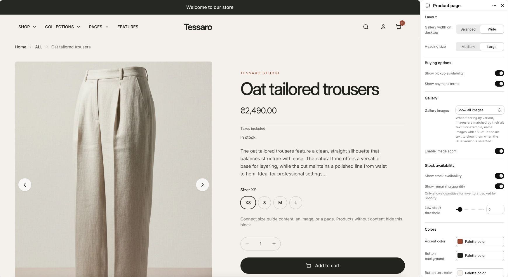
Create the options in Shopify#
- Add options and values to the product, for example Color and Size.
- Set prices, availability and images on the resulting variants.
- When available, configure Shopify’s native swatch color/image data.
- Open the theme editor and choose the presentation in each relevant location.
Three presentation contexts#
| Context | Where to configure |
|---|---|
| Product cards | Theme settings → Product cards → Show color swatches; Color option names; Custom color mapping. |
| Product page | Product page → Variant picker → Color option style: Color swatches, Variant thumbnails, or Text buttons. |
| Quick view | Theme settings → Product cards → Quick view option picker and Quick view color style. |
How swatch content is chosen#
Native Shopify swatch data takes priority. For non-native swatches, the theme checks Custom color mapping; when no usable color/image is available it can fall back to variant/product imagery or a text initial. Variant thumbnail mode uses the variant image when available. Non-color options use their regular controls.
Custom color mapping#
Use one option value and hex color per line. Match the value your product uses. Option-name detection uses the comma-separated Color option names setting; native swatch data can identify a swatch option without that name match.
Navy:#182438
Heather gray:#9A9D9F
White:#FFFFFFTroubleshooting#
- Swatches on cards and the PDP have separate presentation controls; enabling one is not enough to choose every context.
- If a circle is the wrong color, inspect native swatch data first, then the mapping.
- If thumbnails repeat, connect a distinct image to the relevant variants.
- If Color is translated, include the option name used by your product data.
- Combined listings and cross-product option navigation require Shopify’s eligible product setup and additional store-specific testing.