Try this setup#
Open in the editor Home page → Featured products
Put a focused collection within easy reach.
- Open Featured products and choose the collection you want customers to browse.
- Set the heading and product count. Start with a small, coherent selection so visitors can understand the offer.
- Preview the cards with your real product images and titles. Check the carousel on a phone as well as desktop.
See the Featured products controls
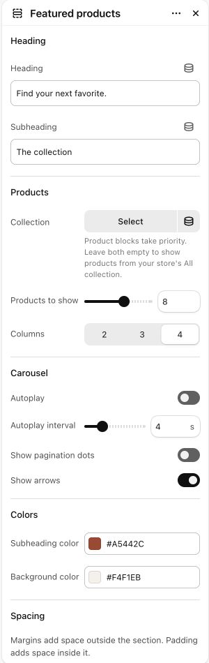
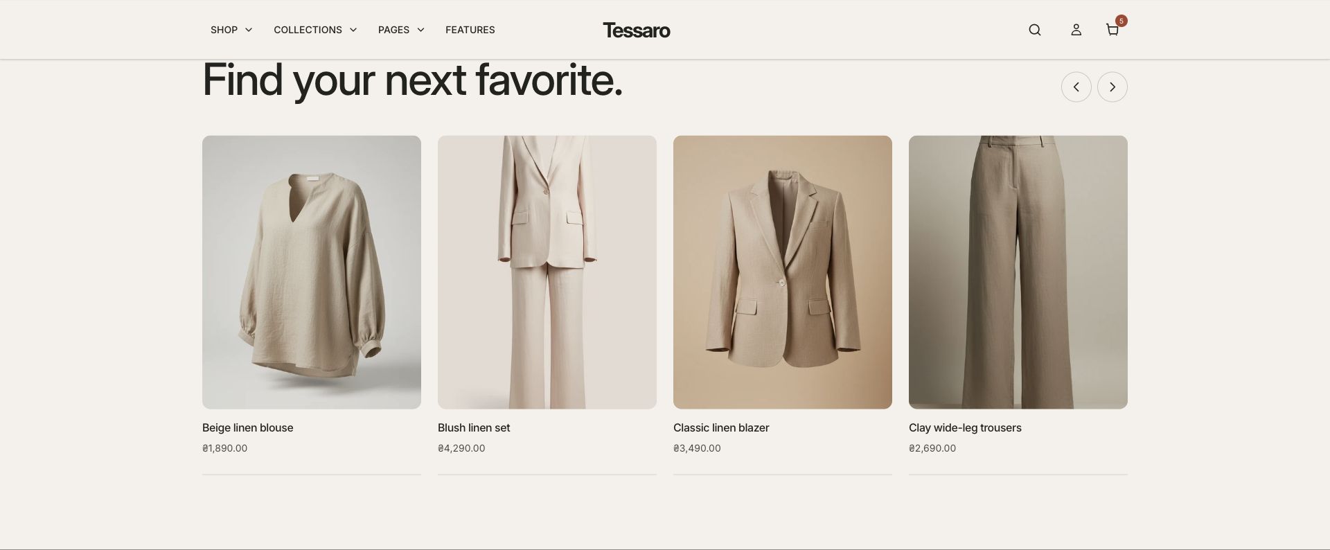
What to look for The cards show the right products, prices and availability. The example uses products already in the store; a theme ZIP does not import them.
When to use it#
Display products from a selected collection in a carousel.
Set up#
Select the collection, choose columns and product count, then configure arrows and autoplay.
Available from Add section where supported by its template restrictions.
Section settings#
These are schema defaults. Your installed theme or selected preset can use different saved values.
Heading
Heading#
Adjust this control in the theme editor and preview the result in the relevant template.
- Control
- text
- Default
- Featured products
Subheading#
Adjust this control in the theme editor and preview the result in the relevant template.
- Control
- text
- Default
- Not set
Products
Collection#
Product blocks take priority. Leave both empty to show products from your store's All collection.
- Control
- collection
- Default
- Not set
Carousel
Autoplay#
Adjust this control in the theme editor and preview the result in the relevant template.
- Control
- checkbox
- Default
- On
Show pagination dots#
Adjust this control in the theme editor and preview the result in the relevant template.
- Control
- checkbox
- Default
- On
Show arrows#
Adjust this control in the theme editor and preview the result in the relevant template.
- Control
- checkbox
- Default
- On
Colors
Subheading color#
Adjust this control in the theme editor and preview the result in the relevant template.
- Control
- color
- Default
- #806042
Background color#
Adjust this control in the theme editor and preview the result in the relevant template.
- Control
- color
- Default
- #F9F5EF
Spacing
Margins add space outside the section. Padding adds space inside it.
Blocks#
Add, reorder and configure the supported blocks in the editor. Some block types have an individual limit.
Product#
Product#
Adjust this control in the theme editor and preview the result in the relevant template.
- Control
- product
- Default
- Not set
App block#
This item has no merchant-editable settings.