Try this setup#
Open in the editor Home page → Editorial spotlight
Give visitors one clear reason to explore your collection.
- Select the first Editorial spotlight in the Home page template. Write a short Heading and, if useful, an Accent heading.
- Choose Image and Mobile image. Use a photo with enough clear space for your text; the illustration below appears until you connect media.
- Set a useful Button label and Button link, such as your main collection. Adjust the overlay and text colors against your chosen photo.
See the Editorial spotlight controls
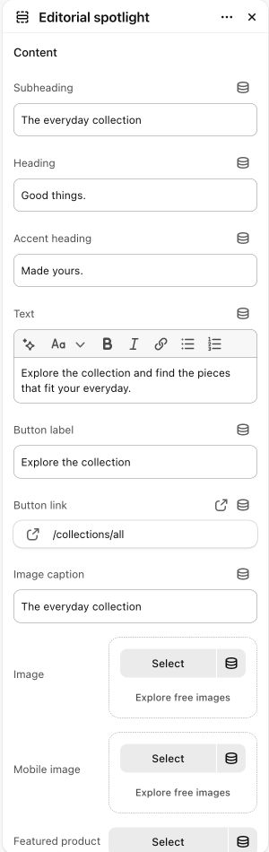
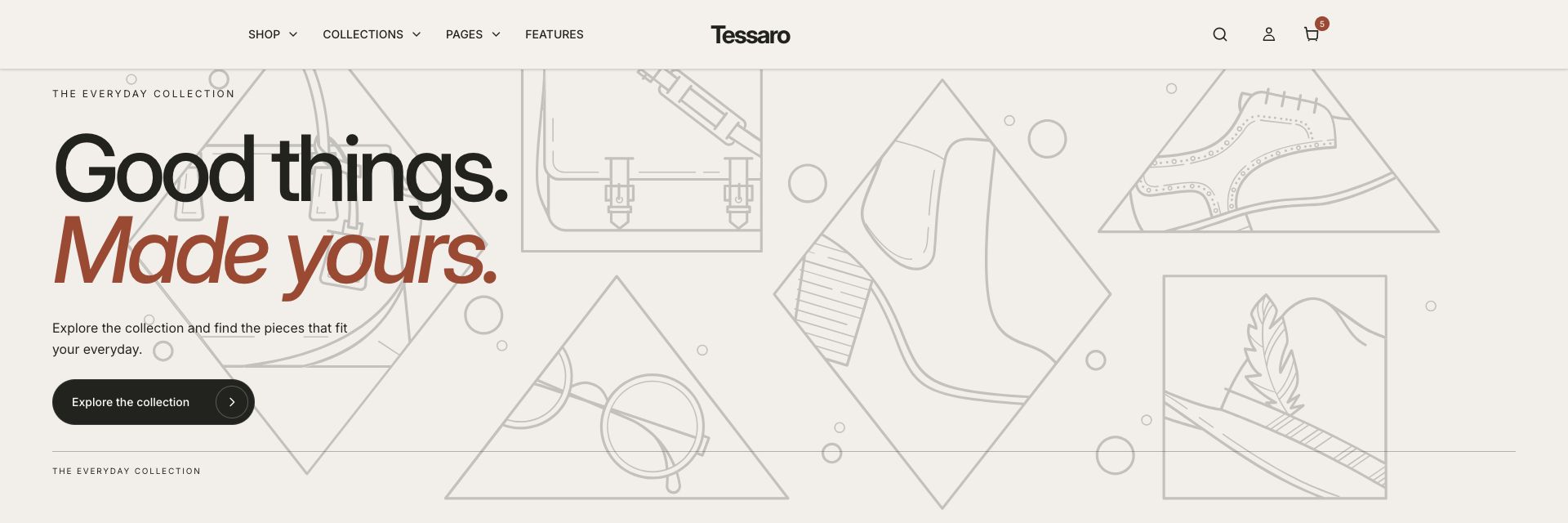
What to look for The heading is readable on the actual image, and the button leads to the intended collection.
When to use it#
Create an immersive or split editorial banner with optional product context.
Set up#
Choose the layout, desktop/mobile media, heading and accent text, then the optional product or button destination.
Available from Add section where supported by its template restrictions. Excluded from: groups: header, footer
Section settings#
These are schema defaults. Your installed theme or selected preset can use different saved values.
Content
Subheading#
Adjust this control in the theme editor and preview the result in the relevant template.
- Control
- text
- Default
- The considered collection
Heading#
Adjust this control in the theme editor and preview the result in the relevant template.
- Control
- text
- Default
- Less, but
Accent heading#
Adjust this control in the theme editor and preview the result in the relevant template.
- Control
- text
- Default
- better.
Text#
Adjust this control in the theme editor and preview the result in the relevant template.
- Control
- richtext
- Default
- <p>Considered pieces. Unexpected combinations. A wardrobe that feels like you.</p>
Button label#
Adjust this control in the theme editor and preview the result in the relevant template.
- Control
- text
- Default
- Explore the collection
Button link#
Adjust this control in the theme editor and preview the result in the relevant template.
- Control
- url
- Default
- Not set
Image caption#
Adjust this control in the theme editor and preview the result in the relevant template.
- Control
- text
- Default
- A new perspective on everyday dressing.
Image#
Adjust this control in the theme editor and preview the result in the relevant template.
- Control
- image picker
- Default
- Not set
Mobile image#
Adjust this control in the theme editor and preview the result in the relevant template.
- Control
- image picker
- Default
- Not set
Featured product#
Adjust this control in the theme editor and preview the result in the relevant template.
- Control
- product
- Default
- Not set
Show product card#
Adjust this control in the theme editor and preview the result in the relevant template.
- Control
- checkbox
- Default
- On
Layout
Use full width#
Adjust this control in the theme editor and preview the result in the relevant template.
- Control
- checkbox
- Default
- Off
Typography
Italic accent heading#
Adjust this control in the theme editor and preview the result in the relevant template.
- Control
- checkbox
- Default
- On
Colors
Background#
Adjust this control in the theme editor and preview the result in the relevant template.
- Control
- color
- Default
- #F4F1EB
Text#
Adjust this control in the theme editor and preview the result in the relevant template.
- Control
- color
- Default
- #22221F
Accent#
Adjust this control in the theme editor and preview the result in the relevant template.
- Control
- color
- Default
- #A5442C
Button#
Adjust this control in the theme editor and preview the result in the relevant template.
- Control
- color
- Default
- #22221F
Button text#
Adjust this control in the theme editor and preview the result in the relevant template.
- Control
- color
- Default
- #FFFFFF
Product card background#
Adjust this control in the theme editor and preview the result in the relevant template.
- Control
- color
- Default
- #FFFFFF
Product card text#
Adjust this control in the theme editor and preview the result in the relevant template.
- Control
- color
- Default
- #22221F
Spacing
Margins add space outside the section. Padding adds space inside it.